Context
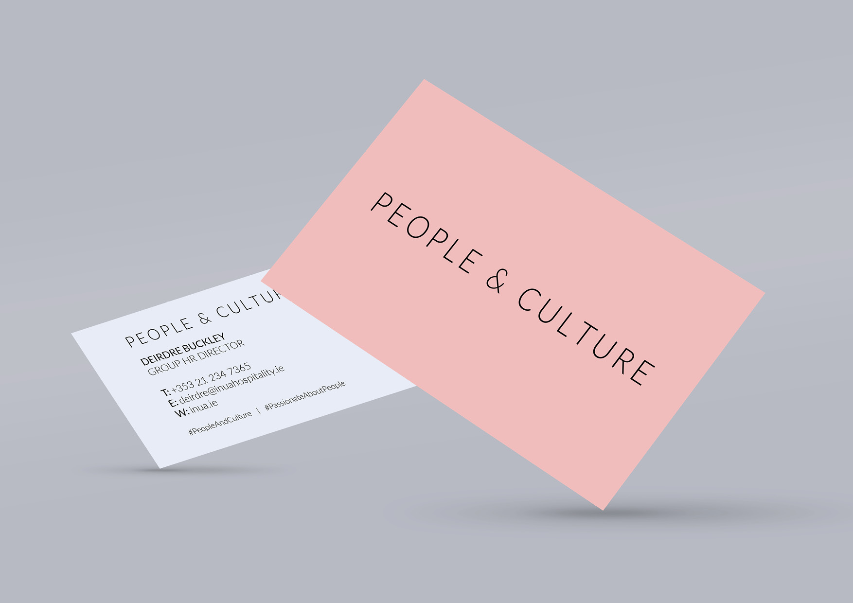
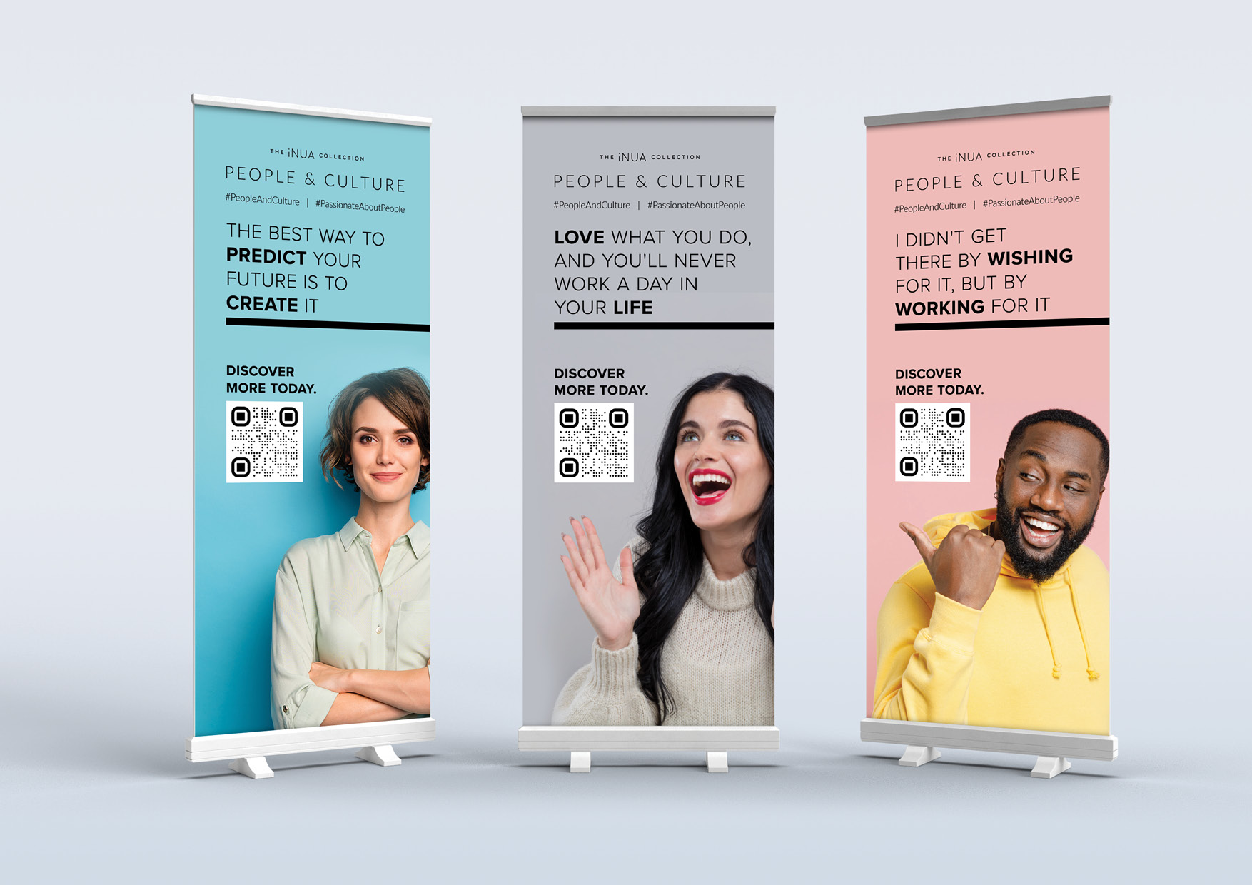
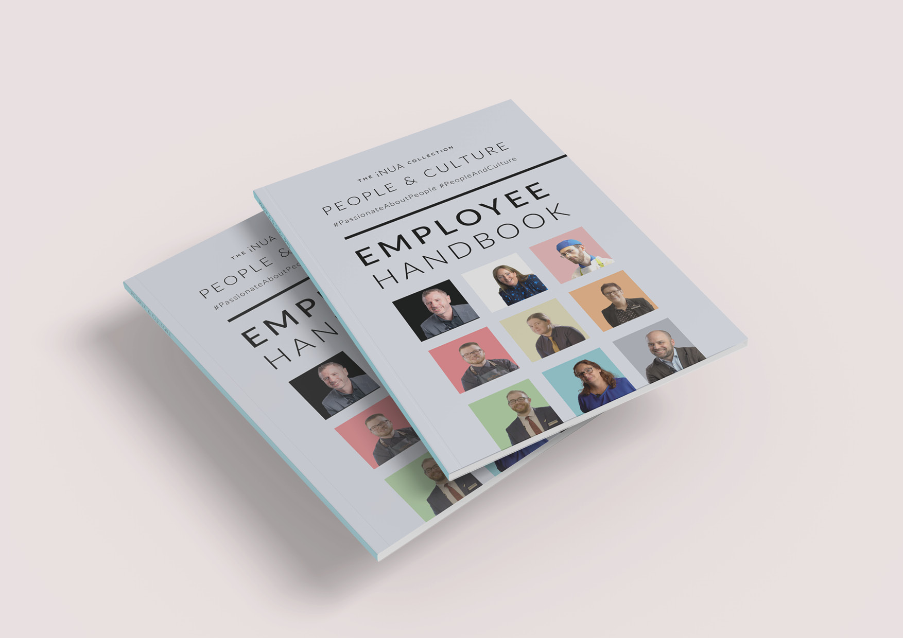
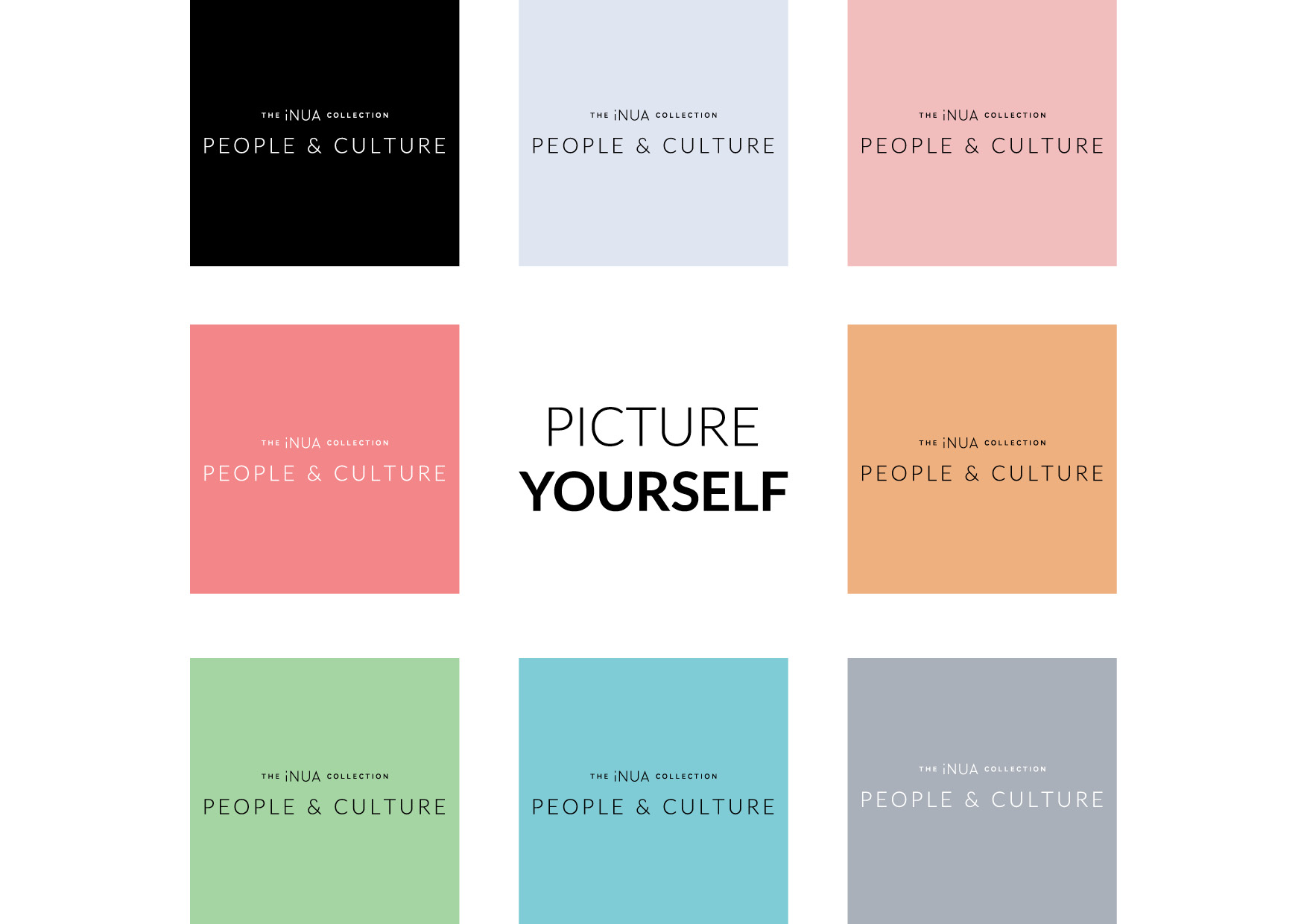
My priority with this piece was to communicate visually why the hospitality industry could be an attractive area to work in. I spoke with my colleagues who had experience working in hotels, bars, and restaurants. The responses spoke about “energy”, “fun” and how much of a “buzz” they felt from working in a fast paced environment, where they interacted with a wide range of people. This feedback was integrated into the colourful, light-hearted colour palette. A crisp black and white was also included, allowing the brand adapt as appropriate between internal documents and external recruitment advertising. Photos of actual hotel colleagues were used to emphasis the “people first”, nature of hospitality. The collateral also invites the audience to imagine themselves as part of this growing and dynamic business.
Challenges
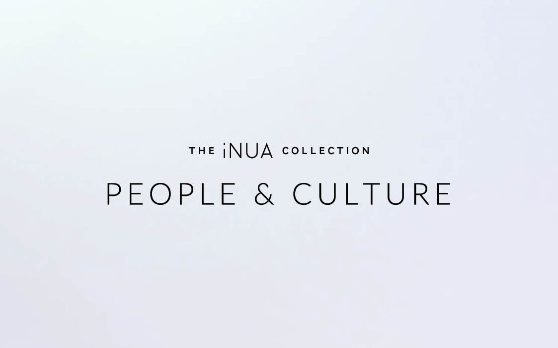
One challenge with this project, was that the brand needed to be able stand alone, and with the main iNUA Collection brand. I kept the logo simple and sleek with a sans serif typeface. Then designed the look and feel in a modular fashion, so that both brands could comfortably sit together, or apart, as needed.
Conclusion
The roll out of the new People and Culture brand has been very successful, with both internal employee retention and external recruitment reporting a significant increase since it’s launch. The iNUA Collection, and it’s sister company Cliste Hospitality, have been continuing to expand at a rapid pace, so this brand played a pivotal role in business’s long term strategies. Working on the brand was a very interesting and educational experience.