Context
I was tasked with designing assets for a new summer campaign on behalf of The iNUA Hotel Collection. The purpose of the campaign was to promote iNUA, and incentivise domestic consumers to holiday in Ireland by highlighting some of the country’s hidden “unseen” wonders.
Brief
The concept of the campaign was to “celebrate the often unseen wonders right on our doorstep”. The look and feel needed to be bold, colourful and fun.
Process
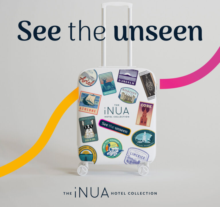
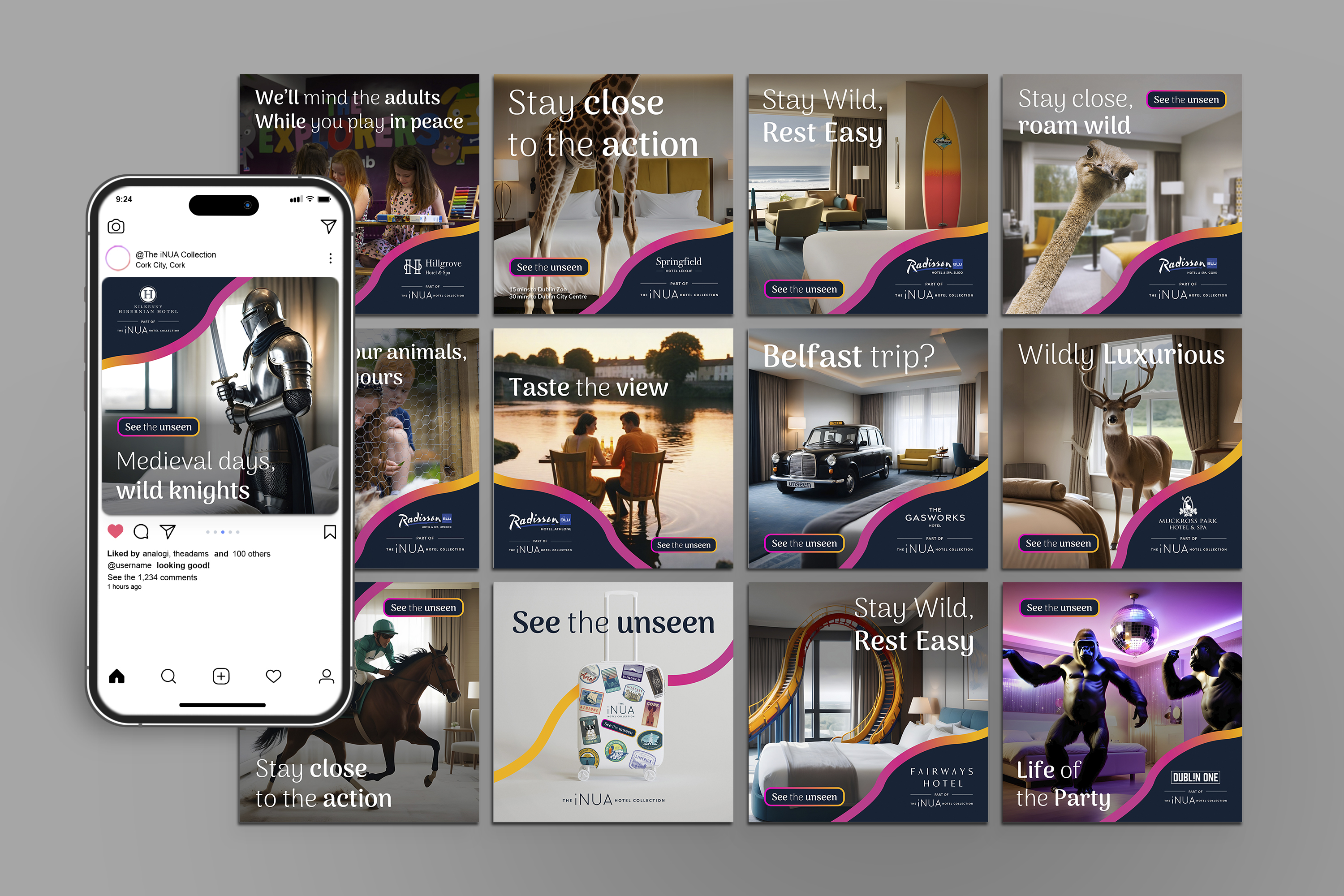
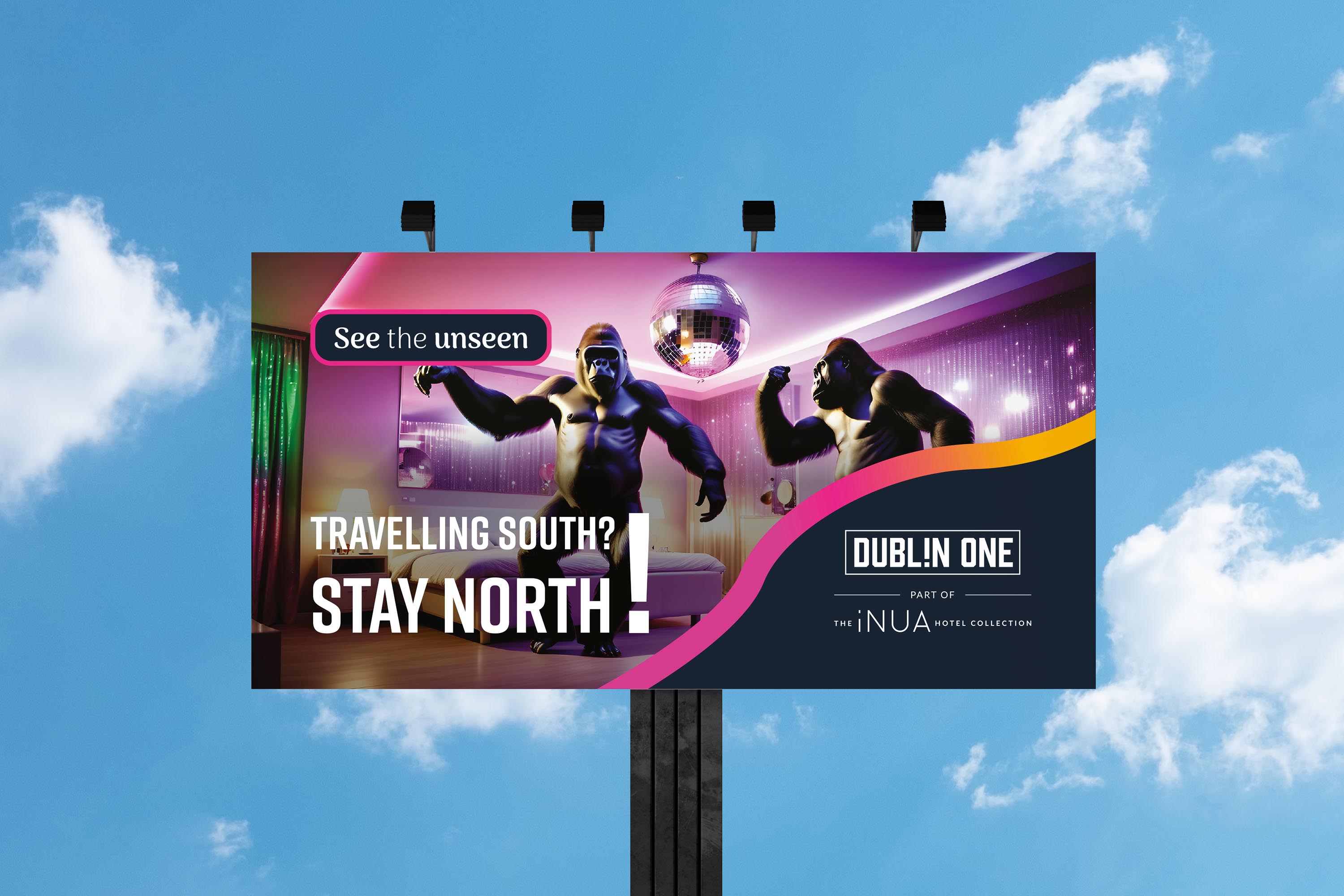
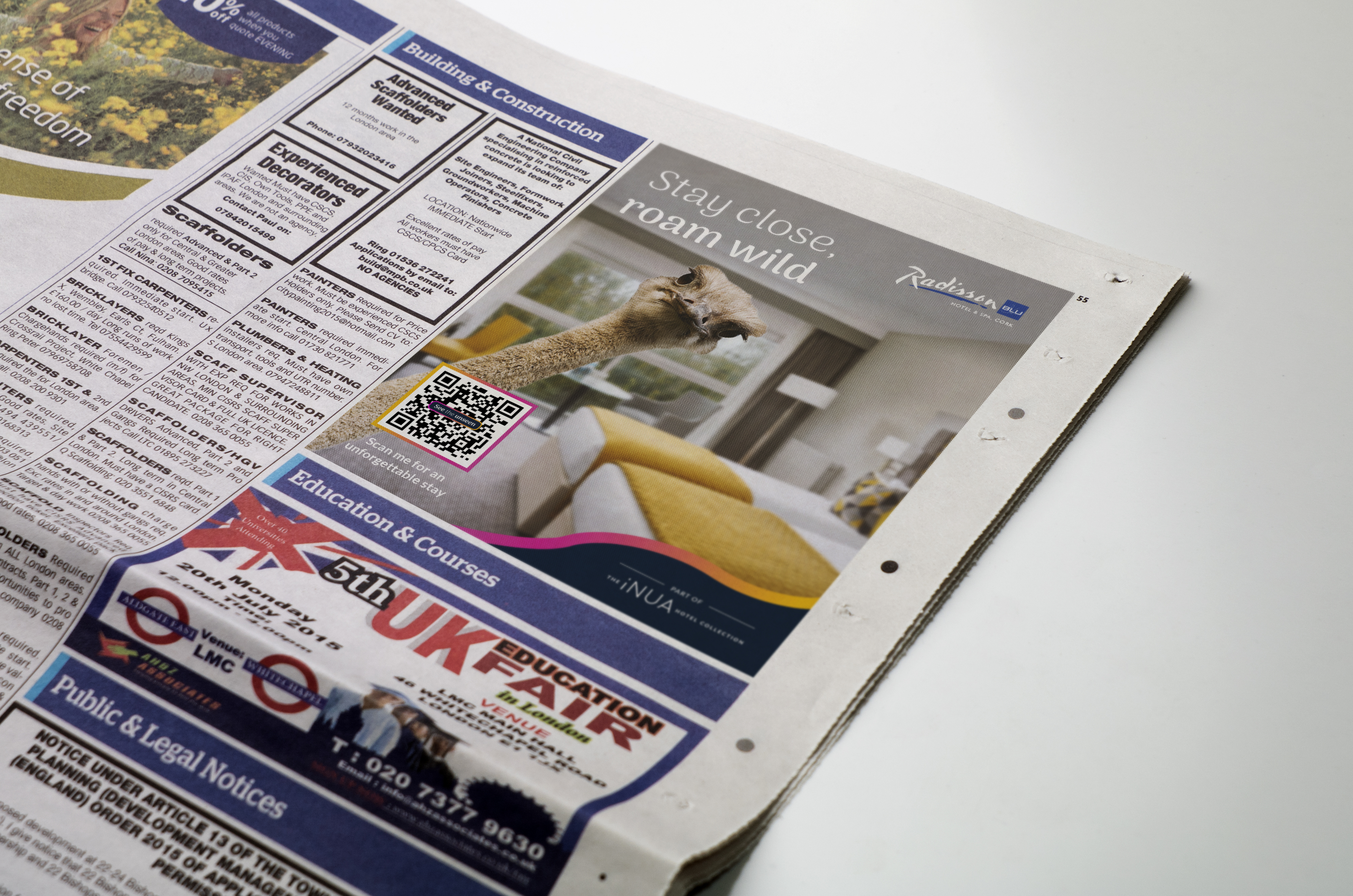
My priority was to capture a catchy tagline that would tie the whole campaign together across platforms. I came up with the line “See the Unseen” as it summed up very simply the core message.
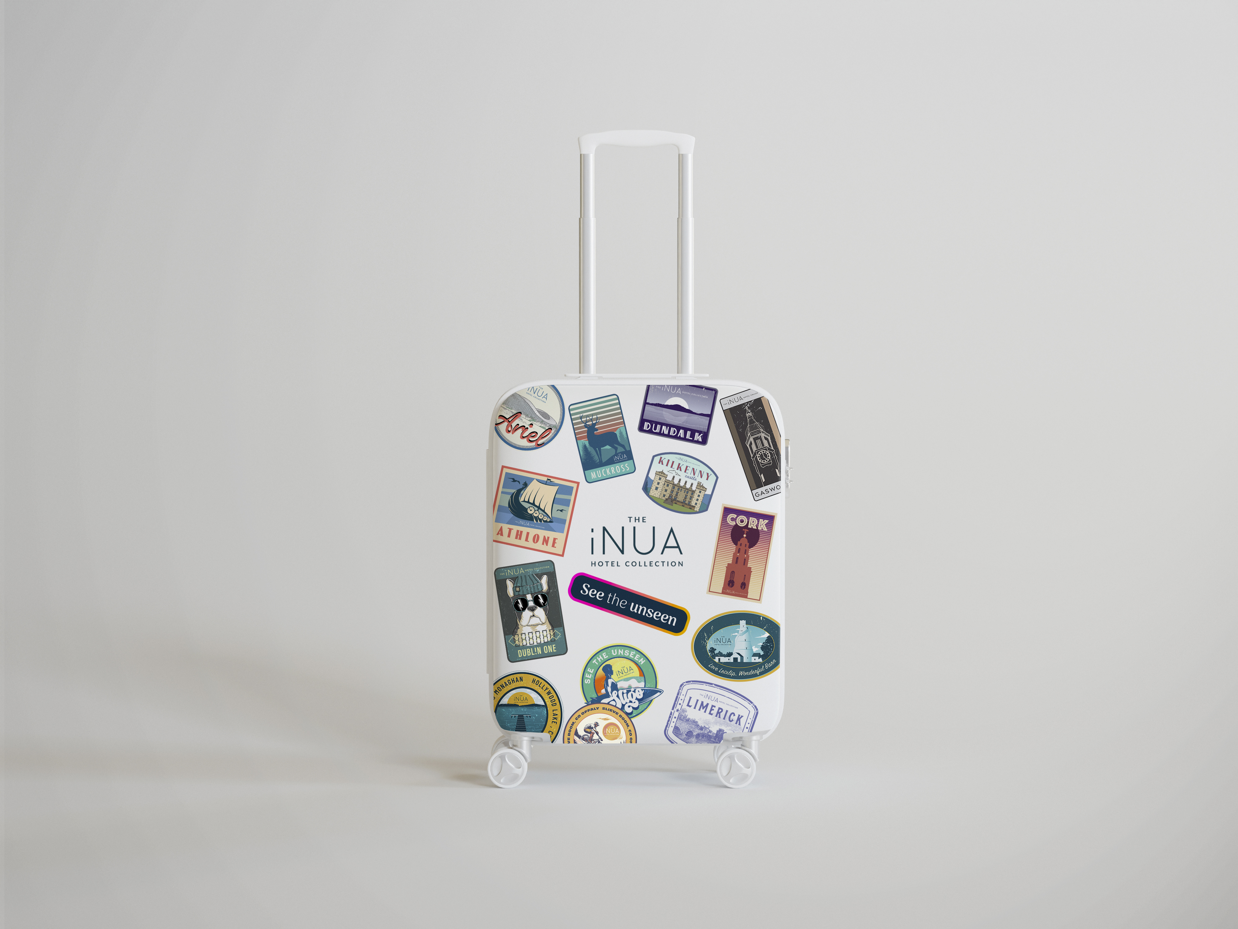
There were two main parts to this campaign – the main campaign itself, where I utilised AI imagery for the first time, and the PR collateral (the travel suitcase pictured above.)
For the main campaign, the challenge was to draw people into each hotel property, and show them what wonderful attractions were available on their doorstep. My team took an unconventional approach to this brief. Most hospitality marketing collateral tends to focus on highlighting the destination with scenic landscape imagery. Instead, we brought the destination inside each hotel, showing what adventures are “unseen” and available to be “seen” right outside your window. To capture this surreal and dream like premise, AI imagery was generated to create impossible scenes, allowing the audience audience to engage and imagine their what their “unseen” holiday could look like. Each of the images nodded to the “unseen” tourist attractions available at each iNUA hotel property. The bright colourful gradient lines suggest a fun, endless summer of holidaying and adventuring across the island of Ireland.
As part of the PR collateral for the campaign, I was tasked to design suitcase stickers, one representing each of iNUA’s hotel properties. Similar to the main campaign, the stickers highlighted different tourist attractions near each hotel in the collection. I deliberately went for a “weathered” vintage look, as if a traveller had collected many stamps and postcards along their travels. Each hotel sticker need to capture that hotel’s property and feel unique, while also maintaining a consistent overall look and feel.
Challenges
The number one challenge with this project was getting to grips with using AI generated imagery for the first time. There was a steep learning curve in figuring out which AI platform was the most effective and user friendly for generating imagery. There was also a great deal of trail and error in figuring out how best to construct prompts in order to produce the desired result. I did find that I had to retouch many of the AI images afterwards in Photoshop before applying them to the campaign, but using AI allowed me to conceptualise and iterate ideas much, much faster than would have previously been possible. I had a lot of fun working with AI, and was able to create dream like images that truly captured the spirit of the campaign.
Conclusion
This was an exciting campaign that challenged me and pushed me outside of my comfort zone. After working on these assets, I am eager to continue experimenting with AI and incorporating it into my workflow more in future.