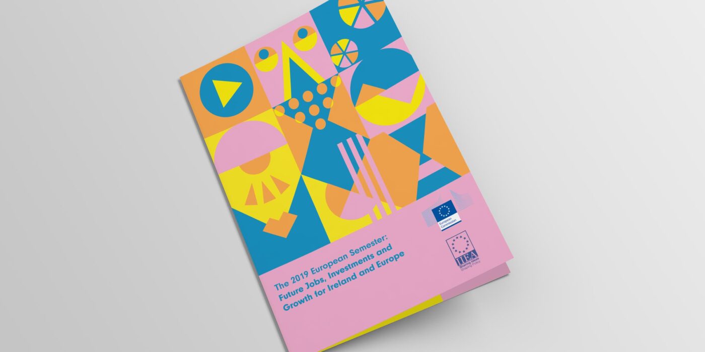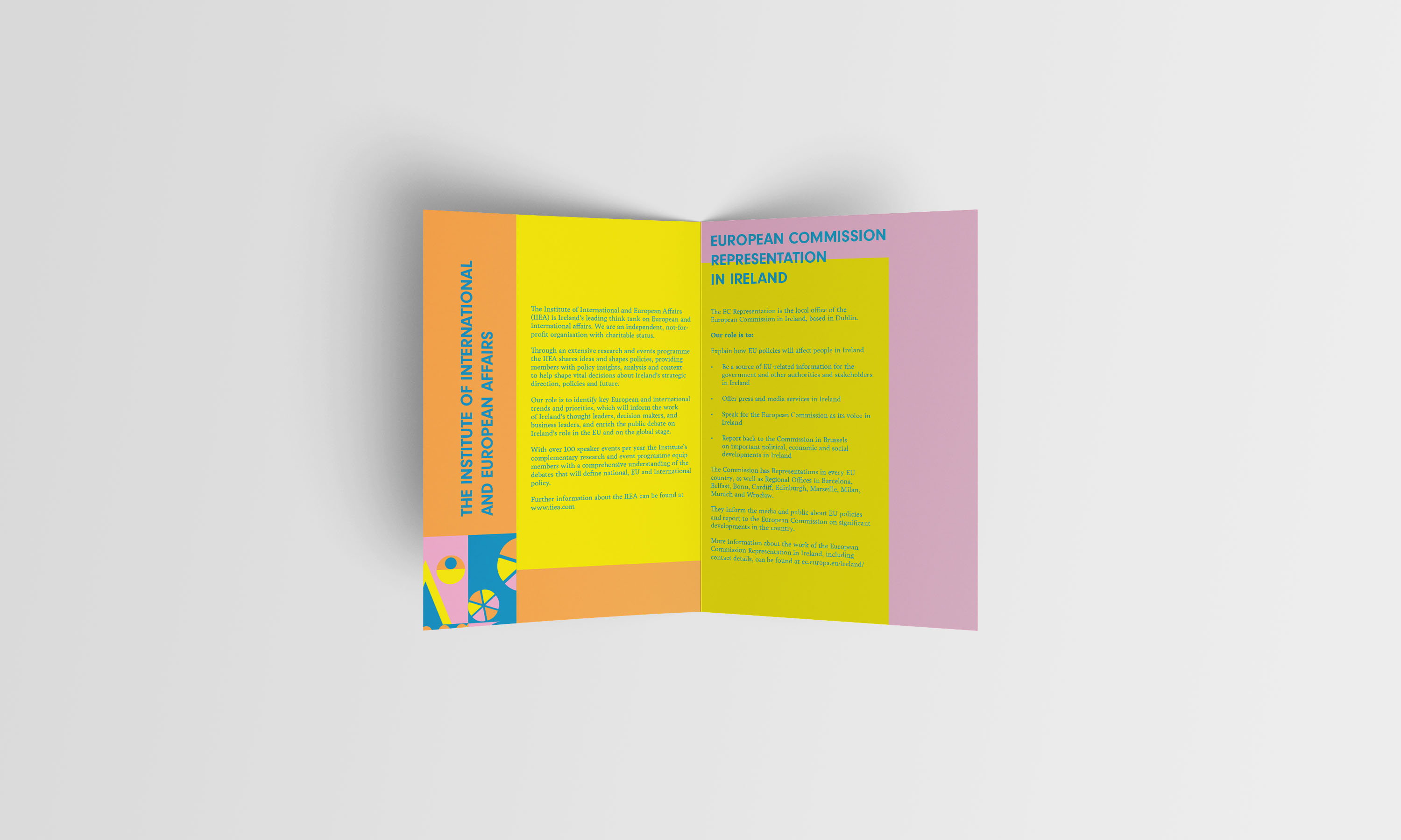
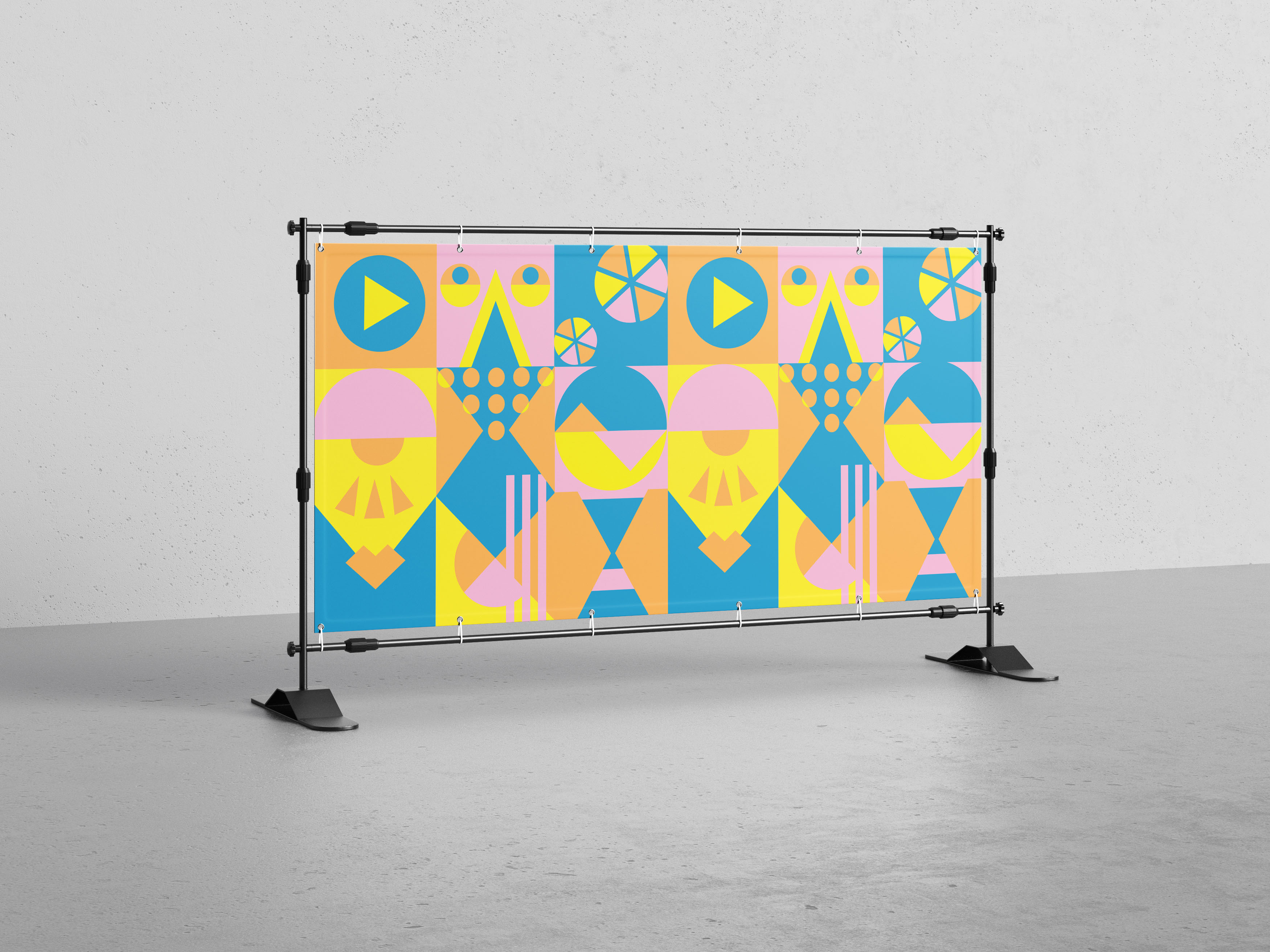
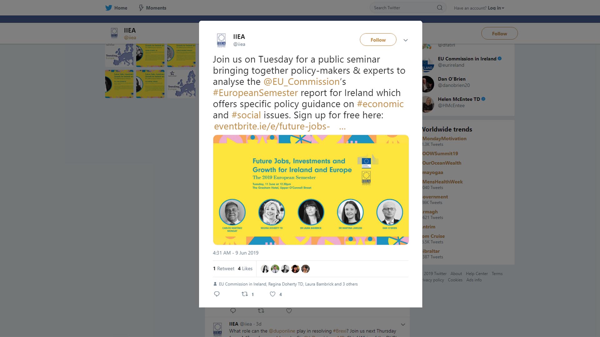
I began my design process with a mind map and exploratory sketches. I considered the concept of “employment” from many angles, and in particular, was cautious about staying away from ‘cliche’ depictions of certain professions. After doing some research, I noticed many of the illustrations I was looking at felt flat and predictable. I decided to take a broader approach. I avoided making the visuals too literal, and created a series of more abstract illustrations depicting working life. Simplifing the illustrations into abstract patterns, suggested various aspects of working life, without being too explicit. This allowed me to avoid basing my illustrations on stereotypes of different professions. In keeping with the client’s request, I adopted a bright, colourful and eye catching colour palette that would help to draw in a younger audience.
Challenges
One of the most challenging aspects of this particular project was the client’s concern about the colour scheme – in particular, the use of the colour pink. I drew their attention back to the brief, and communicated to them how I felt the colour scheme was eye-catching, and would draw in a younger audience. In my research, I had noted that many employment fairs (that would similarly draw in a younger audience who as concerned about work prospects) also used very vibrant colour schemes. After further consultation, they decided to trust my judgement, and the design was successfully pitched to them.
Conclusion
The turnout for the event was almost double what it had been the previous year, with a noticeably younger audience. My design met the needs outlined in the brief, fulfilling the client’s ambition to increase attendance, and drawing in a more diverse age group of attendees. This project was an excellent opportunity. Getting to work on the branding for this event a second year in a row allowed for reflection on how my process and designs had developed from the previous project. It was a privilege to be asked back to work on the 2019 event branding.
